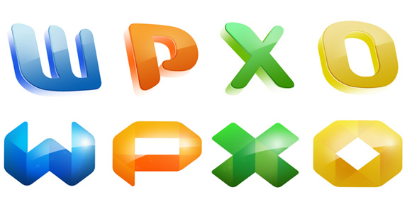
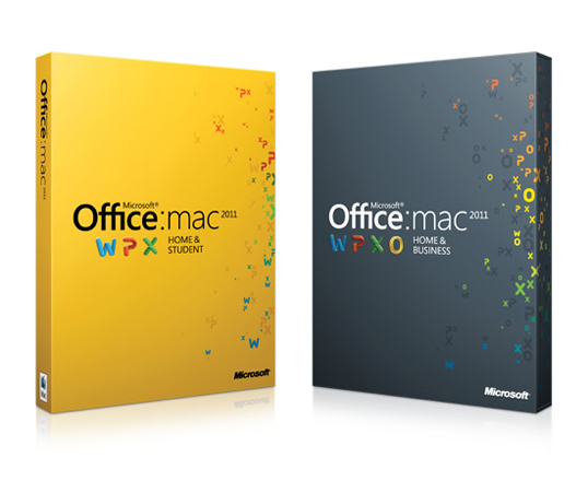
Like a square peg in a round hole that has been forcefully and successfully been pushed through, Microsoft's Office for Mac suite of productivity tools has been living in Mac users' desktops since the late 1980s and has gradually become less annoying to use with the 2004 and 2008 versions making substantial effort to play nicely. The latest Office for Mac version is the 2011 suite and it comes with a fresh coat of paint to the user interface, the application icons and the packaging. The latter two of Brand New's interest, designed by frog.
When we partnered with Microsoft to create a brand story for the launch of Office for Mac 2011 we quickly realized the product went way beyond productivity for the 75 percent of Mac owners that use the product. These students, entrepreneurs, and families use Office for Mac to create, mold, and share their ideas with each other and millions of Windows Office users.
— Frog's blog
We enlisted designers from frog studios around the world in a two-week design shootout to create a huge variety of concepts. Three finalist concepts were chosen for further development, and all three leveraged the brand equity of the iconic letterforms, 'W, P, X and O' that have defined the Office for Mac since 2001.
— Frog's blog

The two runner-ups.
The final identity design (which was originally conceptualized by a frog in Shanghai) was chosen because the letter forms felt very realistic, bold, and dynamic. The 'W, P, X and O' appear to be made by someone bending a raw material into the forms. It's yet another nod to the hard work of our inspirational entrepreneurs. This concept was redrawn to exacting standards and proportions and refined over the course of several months.
— Frog's blog
![]()
The previous icons, designed by Landor, have always seemed like water park tube slides to me, but I always found them strangely enjoyable in a futuristic kind of way. The new ones dial down that UFO aesthetic and introduce a softer, more relatable feel with the rubbery finish of the icons. Removing the drastic perspective also makes the new ones feel less cartoonish and more, well, normal. The 'W' for Word is the best resolved for the ribbon concept and the 'X' the least, I wish it had been resolved without having to split it into two ribbons. But it's really a minor complaint, as the new icons are remarkably elegant and sophisticated, especially in contrast to what the poor suckers who use PCs got for the latest Office version, below.

Office for PC 2010 icons. Reviewed here.
Frog also designed the new packaging which is, simply, hot. A great integration of the icons and a very nice simplicity to the box that will stand out so much better on the shelves of the Apple Store.
