In redesigning the logo for Norton motorcycles, Carter Wong looked to the brand's heritage for inspiration. The result takes the best elements from the many versions of an identity that Norton bikes have sported since 1915...

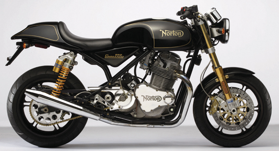
The Norton Commando 961SE, complete with the new identity by Carter Wong
The Norton Company was founded in 1898 by James Lansdowne Norton. Norton also designed the company's inaugural logo, which didn't actually appear until the 1913 catalogue and on bikes until 1915. Company legend has it that the identity was created at the family dining room table with help from his eldest daughter, Ethel. The 'curly N' logo has since been redrawn, adapted and embellished upon on numerous occasions.
It was design studio Carter Wong's belief that their work should result in a subtle shift from the existing logo where some careful detailing would, they say, 'retain all the positive and ownable assets of the logo as it stood, but do away with the awkward shapes, nuances and curves that had appeared over time.' Carter Wong were aided in the redesign of the identity by master typographer Geoff Halpin.

Norton motorcycles' new logo
'On a project such as this, looking back is always a sound place to start moving forward, and this proved a true revelation to us on a number of scores,' says Carter Wong's Phil Carter. 'The first was our initial idea of doing away with the double crossing of the 't' as we thought that the one provided by the dynamic swoosh should prove sufficient.'

Norton logo iterations through the ages, 1907-2009
It was only when researching the development of the original logo that Carter Wong realised that in their own redesigns they were honouring the very first configuration of the identity, designed by Norton and his daughter.
By 1924, however, the double crossed 't' had made an appearance, possibly so the letter would not be mistaken for an 'l'. Further enquiries into the company's heritage brought up other elements that Carter Wong thought should be readdressed.
'The two ‘o's had an element of speed to them, both leaning at an angle to create this illusion,' says Carter. 'It was only after manipulating these shapes that the correct amount of motion was achieved by turning the counters only – the inside shapes – rather than the whole letterform. By doing this we created the element of tension as in the original, just where these ‘tyres' would touch the surface.'
Other minor changes included creating a more voluptuous and dynamic swoosh and various tweaks of serifs and spaces to create a balanced logo with a distinct nod to the company's long heritage.


Sketches from Carter Wong's work on the Norton identity