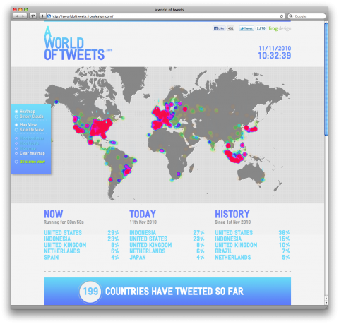
A World of Tweets shows you with a heat map visualization where people are tweeting at from the past hour. The more tweets there are from a specific region, the “hotter” or redder it becomes. This continuous collection of Twitter statuses shows in what an incredible tweeting world we live in. Check out the 3D view!
A project by Frog Design.
(thank you fabulous John Ford)