Friday 24 December 2010
Friday 17 December 2010
Burroughs Corporation Ads

A great set of vintage print ads for the defunct computer manufacture Burroughs Corporation. Most of the ads were designed by Campbell-Ewald. I also love this Burroughs ad that has that great vintage computing look to it. There’s a lot to be said about the simplicity of these designs.
Vimeo Video School is now in session

We have a confession to make: for over a year, we've been planning and working on something that we haven't really talked about until right now. We're excited to announce that we're launching a whole new section on Vimeo: Vimeo Video School.
We realized that one of the best ways we could nurture the incredible range of creativity on the site would be to build a system that easily allows members of all skill levels to learn more about making videos and expand their knowledge base. We're covering everyone, from people picking up a video camera for the first time, to seasoned pros that need info on the newest technology.
Video 101
For the beginners, we've personally created a series of entry-level instructional videos. These are a perfect way to help your friends and relatives who have little experience get started on the path to making great videos. We hope these 101 videos will answer a lot of first time questions and demystify the process of making videos. They're fun, so check them out and share them with your friends.
DSLR Basics with Philip Bloom
For everyone who just bought a DSLR camera and wants to learn about the incredible potential they have, Philip Bloom and Andrea Allen have created a helpful series that covers everything you need to know. Honestly, these videos are worth watching just for the chemistry between these two goofs. Plus, you might even learn a thing or two.
Vimeo Lessons
In addition to this, we'll be crafting a series of Lessons, which are tutorial posts that incorporate some of the amazing instructional videos our members have created. We've designed these to be a super easy way for you to take your skills to the next level. Most Lessons include a challenge at the end that allows you to show off what you've learned and interact with your fellow talented Vimians who have also participated in the challenge.
Tutorial Categories
In order to cover even more ground, we've categorized another 1,000 user-made tutorials into easy-to-browse sections. Jump right in to any category and check out all the helpful videos our members have made on a wide range of topics.
We think that Vimeo Video School has a wealth of information for you right now, but of course we will continue to add to it and further develop this section. Feedback from our members has always played a key part in our development, and we're looking forward to hearing your ideas about how we can make this even better.
One last thing, if you have any content that you think would work well in Vimeo Video School, please submit it to us! You may also find yourself inspired to create brand new tutorials to pass on your video wisdom. We're excited to see what you do.
Everyone have fun exploring and learning from Vimeo Video School and stay tuned for great new content! Go check it out!
Love,
Vimeo
UNKLE – Runaway (Pointman Re-edit)
Director and part of the British music group UNKLE, John Nolan creates a new video for their track Runaway. The video features one of the brand’s adopted signatures, the Pointman as he created in a new robotic form. Previous UNKLE and Pointmen instances were seen on the Psyence Fiction and Never Never Land albums.
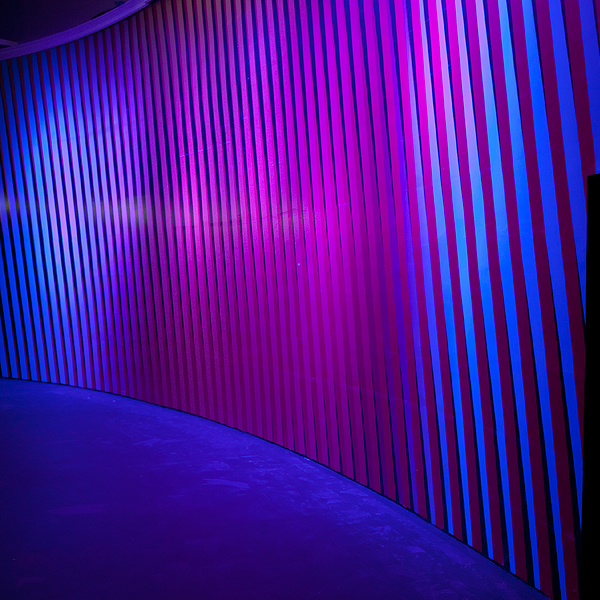
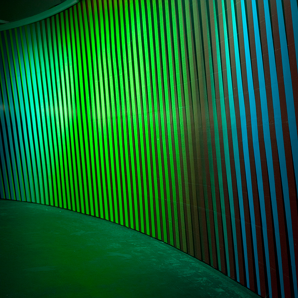
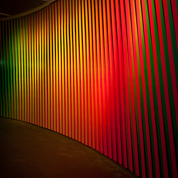
RGB by LMK
a color-changing wall graphic
Colors of light (RGB) interact with colors of print (CMYK). Careful combination of these two color systems can transform static printed graphic elements into an animated, dynamic interaction. New structures and visual coherences are created by the interplay of light color and surface / object color.

Concept
The combination of the color systems RGB (colors of light) & CMYK (colors of print) leads to an emergence (color) and disappearance (black) of structures and surfaces. Different layers of perception are being created. The change of color and the combination of the two systems alter the room and the viewers perception. The installation is supported by an acoustic layer generating further associations.
Graphical concept
A illustration of slightly slanted stripes, colored in a gradient through a whole color range. The color of the stripes modify with changing RGB light. The stripes unfold like a curtain and animate the wall.
Further Information:
Verena Michelitsch
hello.verena@gmail.com

Colors of light (RGB) interact with colors of print (CMYK). Careful combination of these two color systems can transform static printed graphic elements into an animated, dynamic interaction. New structures and visual coherences are created by the interplay of light color and surface / object color.
LMK Video 1 (HD) from Color-Changing Wallpaper on Vimeo.
Concept
The combination of the color systems RGB (colors of light) & CMYK (colors of print) leads to an emergence (color) and disappearance (black) of structures and surfaces. Different layers of perception are being created. The change of color and the combination of the two systems alter the room and the viewers perception. The installation is supported by an acoustic layer generating further associations.
Graphical concept
A illustration of slightly slanted stripes, colored in a gradient through a whole color range. The color of the stripes modify with changing RGB light. The stripes unfold like a curtain and animate the wall.
Further Information:
Verena Michelitsch
hello.verena@gmail.com
Mirror Mirror Snap My Face
Snap a photograph, please and thank you. Freaked out yet? It’s not a spy concept! This is a friendly through-camera photo session, and it goes all year around. This concept goes by the name “Daily you,” and it’s a mirror with a camera embedded into it. Each time you stand in front of the mirror in the morning to touch up your face (or whatever you do there), it detects you looking into it, focuses, and takes a single photograph. Once there is a collection of photos of your face, there’s a “Play” mode which can show you images by week, by month, or annually – or of course, however often you’d like.
As time goes on, the mirror will end up capturing so many photos that you’ll be able to track your most “natural” mirror expressions and see things like color trends in your clothing. As a bonus, basically, since this concept is already super neato, the device collects and uses solar energy as power in order to both save the environment and make a long-lasting piece of technology.
Designer: Albert Chengsyun Tang


Yanko Design
As time goes on, the mirror will end up capturing so many photos that you’ll be able to track your most “natural” mirror expressions and see things like color trends in your clothing. As a bonus, basically, since this concept is already super neato, the device collects and uses solar energy as power in order to both save the environment and make a long-lasting piece of technology.
Designer: Albert Chengsyun Tang
Yanko Design
Thursday 16 December 2010
Citibank Launches “Bank of the Future” in New York

The flagship branch that Citibank opened in Union Square today is a bit different from banks in its other locations.
Instead of picking up a paper brochure, patrons can use one of the six interactive sales walls with touchscreen capabilities to learn more about bank services. Instead of using deposit envelopes, they can use enhanced-image ATMs to deposit checks without them. And instead of waiting for business hours to speak with a customer service representative, customers can use a 24/7 video chat station in the ATM lobby.
The digital components of the 9,700-square-foot branch are based on technologies pioneered by Citibanks in Hong Kong and Singapore.
Some features of the new bank seem more suited for a cafe or a airport lounge than a bank. Customers can access free Wi-Fi (in a private seating lounge if they are Citigold customers), and “media walls” display news, weather, and information about Citibank. Atmosphere Proximity, Citi’s digital agency, also designed a chip with the bank’s social media team that accesses a special Foursquare feed. Whenever a certain amount of people check in to the branch, an “internal marketing screen” shows which users are inside the branch at that very moment.
“We want this branch to be more than just a bank,” Brad Dinsmore, Citigroup’s head of retail banking in North America, said in a speech at the opening ceremony. “We want this branch to be a place where customers view it as a hub, a center of the community, if you will. A place where they feel warm and welcome, that they can come in and experience our free Wi-Fi access.”
Citi plans to open other branches that emulate the Union Square experience in other key U.S. markets, including San Francisco, Washington D.C., Los Angeles and Chicago.


The Great Typekit Table

Finding a good Typekit font for long blocks of text is hard, but Sleepover has sifted through the Typekit library and pared it down to the following list according to two simple rules: first, the font had to have lower case, upper case, bold, italic, and bold italic; second, the font couldn’t be handwriting, script, or monospace. If you think they’ve missed something, or made any mistakes, send a note to contact@sleepoversf.com.
(via unmatchedstyle)
If Apple Made Printers, What Would They Be Like?
A few months ago, over dinner, I somehow fell into a discussion about printers and printer ink. I know it's a pretty bizarre conversation for a dinner out among friends but stranger things happen. So, to make a long story even longer, it all started with a complaint; our dinner companion couldn't believe that she had run out of printer ink in the middle of the night. It was all too familiar to all of us at the table. Why in the world does it always seem to happen to us when we least expect it, and when it hurts the most? And if Jonathan Ive and Apple tried their hand at printer design, how might they solve all these problems?
Let's go back. It's as if there's a plot to drive consumers to create our own stockpile of printer ink. I know I have mine, or so it seems I do. But inevitably when I go to replace the single one that's run low, I have the wrong cartridges in my arsenal. Hell, I've got seven different colors in my printer, and each one has its own separate cartridge. So, I really need to be diligent when I run out of one and head to the store or order it online. Online seems like a great option, but when you order a single cartridge it can add up to $28, with $11 for shipping nearing half the total replacement cost.

Why can't our printers look good and function as simply as our household appliances? Dieter Rams' work at the Design Museum, photo by Luke Hayes
This led us to the next curiosity: How could my $100 printer have hundreds of dollars of printer ink in those little cartridges? When we build up our own stocks to avoid being caught empty, we can easily end up with $300-400 worth of ink on hand. Yet, the last time I prepared this way I got stung when I received a new printer free with a computer purchase. I then had to dispose of the old printer and an array of aging ink cartridges that nobody wanted.
Going into designer mode, I thought I'd investigate the problem further and discovered that this problem is serious -- really serious. According to a study in PC World, printer ink costs over $1000 a gallon -- at least that's what we pay for it -- and over half the ink is thrown away. To make the situation a little more painful, you can't recycle ink unless you're willing to refill cartridges yourself or work with a service, which seems reasonable enough if you're sufficiently upset about the situation to behave responsibly. Yet, the American Consumer Institute estimated that we overspend $6 billion a year on printer ink. And to top it off, by 2012, 1.8 billion cartridges will have been dumped into our landfills (and oceans). Each will take 450 to 1,000 years to decompose -- and that's after creating up to five kilograms of greenhouse gases to produce each cartridge.
There has to be a better way. As a society, we identify pain points and harness them to reflect on our needs and aspirations to create a better world with inspired innovation. Or we try to, right? Then it came to me. Why not take the modern 'Apple' approach to the ink model -- simple, intelligent, minimalist and user-friendly? Who here remembers that Apple used to make printers, and would like to see Apple help us yet again?
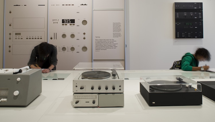
Would Apple's printer look something like this? Electronics at the Dieter Rams exhibition at the Design Museum, photo by Luke Hayes
I could see having an Apple printer next to me. It would look great, of course, that's always a must since I'm a visual person. But more importantly, it would have the intelligence I've come to expect from Apple. To start it would have this great iPod-like ink cartridge that plugs in and ejects like a CD, going in and out of my iMac. It would link to my computer and monitor, tracking the lifeblood of my printer, reporting usage and calculating remaining print pages. While calculating my usage, the system would monitor and ping me when the time is right, asking if a replacement cartridge can be sent through my iTunes account. I say sure, why not. But then to my surprise, when alerted that I've mostly used black and very little of the colors, it offers to send me my own mix that has a larger amount of black and smaller of color. I just love it when I get this kind of surprise; it always puts a smile on my face and keeps me coming back.
Three days later the cartridge appears on my doorstep along with my Netflix films. Simple enough. I eject my current cartridge, plug in the new one, place the old one in its return packing and box, and place it next to my outgoing movie. They are both picked up and I get a deposit credit back into my iTunes account a few days later for my recycling efforts. I'm happy, Apple does it again, and the world is a cleaner better place for all of us.
Ok, back to the real world. This is just a fantasy for now, but hopefully someone will soon realize the long-term value in 'servicing' our individual printing needs. Maybe it will be Apple. But I can't wait for the day it happens.
Top image: 'ReBraun' by Markus Wolf, part of the Bootleg Objects series featuring modified Dieter Rams products
Let's go back. It's as if there's a plot to drive consumers to create our own stockpile of printer ink. I know I have mine, or so it seems I do. But inevitably when I go to replace the single one that's run low, I have the wrong cartridges in my arsenal. Hell, I've got seven different colors in my printer, and each one has its own separate cartridge. So, I really need to be diligent when I run out of one and head to the store or order it online. Online seems like a great option, but when you order a single cartridge it can add up to $28, with $11 for shipping nearing half the total replacement cost.
Why can't our printers look good and function as simply as our household appliances? Dieter Rams' work at the Design Museum, photo by Luke Hayes
This led us to the next curiosity: How could my $100 printer have hundreds of dollars of printer ink in those little cartridges? When we build up our own stocks to avoid being caught empty, we can easily end up with $300-400 worth of ink on hand. Yet, the last time I prepared this way I got stung when I received a new printer free with a computer purchase. I then had to dispose of the old printer and an array of aging ink cartridges that nobody wanted.
Going into designer mode, I thought I'd investigate the problem further and discovered that this problem is serious -- really serious. According to a study in PC World, printer ink costs over $1000 a gallon -- at least that's what we pay for it -- and over half the ink is thrown away. To make the situation a little more painful, you can't recycle ink unless you're willing to refill cartridges yourself or work with a service, which seems reasonable enough if you're sufficiently upset about the situation to behave responsibly. Yet, the American Consumer Institute estimated that we overspend $6 billion a year on printer ink. And to top it off, by 2012, 1.8 billion cartridges will have been dumped into our landfills (and oceans). Each will take 450 to 1,000 years to decompose -- and that's after creating up to five kilograms of greenhouse gases to produce each cartridge.
There has to be a better way. As a society, we identify pain points and harness them to reflect on our needs and aspirations to create a better world with inspired innovation. Or we try to, right? Then it came to me. Why not take the modern 'Apple' approach to the ink model -- simple, intelligent, minimalist and user-friendly? Who here remembers that Apple used to make printers, and would like to see Apple help us yet again?
Would Apple's printer look something like this? Electronics at the Dieter Rams exhibition at the Design Museum, photo by Luke Hayes
I could see having an Apple printer next to me. It would look great, of course, that's always a must since I'm a visual person. But more importantly, it would have the intelligence I've come to expect from Apple. To start it would have this great iPod-like ink cartridge that plugs in and ejects like a CD, going in and out of my iMac. It would link to my computer and monitor, tracking the lifeblood of my printer, reporting usage and calculating remaining print pages. While calculating my usage, the system would monitor and ping me when the time is right, asking if a replacement cartridge can be sent through my iTunes account. I say sure, why not. But then to my surprise, when alerted that I've mostly used black and very little of the colors, it offers to send me my own mix that has a larger amount of black and smaller of color. I just love it when I get this kind of surprise; it always puts a smile on my face and keeps me coming back.
Three days later the cartridge appears on my doorstep along with my Netflix films. Simple enough. I eject my current cartridge, plug in the new one, place the old one in its return packing and box, and place it next to my outgoing movie. They are both picked up and I get a deposit credit back into my iTunes account a few days later for my recycling efforts. I'm happy, Apple does it again, and the world is a cleaner better place for all of us.
Ok, back to the real world. This is just a fantasy for now, but hopefully someone will soon realize the long-term value in 'servicing' our individual printing needs. Maybe it will be Apple. But I can't wait for the day it happens.
Top image: 'ReBraun' by Markus Wolf, part of the Bootleg Objects series featuring modified Dieter Rams products
10 Free Online Resources for Science Teachers

One of the greatest ways technology can empower teachers is by helping them demonstrate concepts and by making it easier for students to learn through their own exploration and experimentation.
Because science teachers are often called upon to teach topics that are too large, too small, happen too fast, happen too slowly, require equipment that is too expensive, or has the potential to blow up a laboratory, the Internet can be particularly helpful in assisting them convey a concept.
Universities, non-profit organizations and scientists with free time have put an overwhelming number of resources for teaching science on the web. These are nine of our favorites.
1. The Periodic Table of Videos
A group of scientists based at the University of Nottingham added some character to the static periodic table of elements by creating a short video for each one.
Hydrogen, for instance, seems much more exciting after you’ve seen what happens when you hold a match to a balloon that is filled with it, and it’s easier to remember the name Darmstadtium after you have seen Darmstadt.
The group also puts out a non-YouTube version of the site for schools that have blocked the site.
2. Teach the Earth

The Science Education Resource Center at Carleton College has compiled just about every fathomable resource for geoscience educators. By serving as the portal to helpful web pages from dozens of independent project websites, the site provides visuals, classroom activities and course descriptions for everything from oceanography to “red tide and harmful algal blooms.”
3. Stellarium

Stellarium is a planetarium for your computer. Just input your location and explore the sky outside or the view from any other location. The program offers up information on stars, nebulae, planets and constellations according to 12 different cultures.
In addition to being ideal for classroom astronomy lessons, Stellarium’s open source software is also used to light up the screens of a number of real planetariums.
Even though Google Sky won’t give you a view from a specific location, it will direct you to specific galaxies, planets and stars or to a map of the moon that notes where each of the six Apollo missions landed.
4. YouTube
“What happens when you put Cesium in water?” is a question that in some cases is best answered by YouTube. YouTube’s archive of demonstrations have the advantage of being safe, clean and unlikely to catch on fire.
You’ll find experiments for most concepts just by using the search bar. But if you’re in a browsing mood, check out this list of the 100 coolest science experiments on YouTube.
Most schools that block YouTube allow access to educational alternatives like TeacherTube and School Tube.
5. NASA Education

NASA has lesson plans, videos and classroom activities for science subjects ranging from Kindergarten to university levels. The best part of this resource gold mine is that it’s easy to search by keyword or to browse by grade level, type of material or subject.
Check out the Be a Martian Game, the interactive timeline and the NASA Space Place for some smart fun.
6. Learn.Genetics

These resources for learning about genetics by the University of Utah’s Genetic Science Learning Center include interactive visualizations, 3D animations and activities. Student activities include taking a “tour” of DNA, a chromosome or a protein, building a DNA molecule, or exploring the inside of a cell.
The university is also building a sister site, Teach.Genetics, with print-and-go lesson plans and supplemental materials for some channels on the Learn.Genetics site.
7. The Concord Consortium

The Concord Consortium is a non-profit organization that helps develop technologies for math, science and engineering education. Their free, open source software is available for teachers to download to use in their classes. They include visualizations and models for a broad range of topics.
Some examples include: The Molecular Workbench, a free tool that creates interactive simulations for everything from cellular respiration to chemical bonding. Geniquest introduces students to cutting-edge genetics using dragons as their model organisms; Evolution Readiness is a project designed to teach fourth graders about evolution concepts using simulations; and The ITSI-SU Project provides lab-based activities involving probes, models and simulations.
To search for classroom activities across all projects, teachers can use the site’s Activity Finder to browse by subject, grade level or keyword.
8. The ChemCollective

The ChemCollective, a project that is funded by the National Science Foundation, allows students to design and carry out their own experiments in a virtual laboratory and provides virtual lab problems, real-world scenarios, concept tests, simulations, tutorials and course modules for learning basic chemistry.
The project recently won a Science Prize for Online Resources in Education from Science Magazine.
9. Scitable

Scitable is both the Nature Publishing Group’s free science library and a social network. Teachers can create a “classroom” with a customized reading list, threaded discussions, news feeds and research tools. There’s also an option to use the material on the site to create a customized e-book for free that can include any of the more than 500 videos, podcasts or articles on the site.
Topic rooms combine articles, discussions and groups related to one key concept in science and make it easy to find material that is relevant to your class and connect with people who are also passionate about the subject.
What resources did you find most helpful, or what great science tools did we miss? Let us know in the comments below.
10. Impact: Earth!

Want to see how a particular projectile from space would affect the Earth? With this tool that was developed for Purdue University, your students can enter the projectile parameters, angle and velocity to calculate what would happen if the object were to actually hit Earth. You can also get the details on the projectiles that caused famous craters.
Joakim Norman

"I've always been intrigued by candy and confectionary aesthetics. The colors, the blissful feeling and total unpretentiousness. That's what I wanted my own business to feel like. So I made hundreds of chocolate business cards, bigger chocolates to give away (with a golden coupon inside, Willy Wonka style), letters in classic Swedish candybag-paper style, a bag with nougats that represents my services and a big box to send to potential customers. And of course a website. Everything folded and designed hand (except for the actual chocolate, I don't want to poison people...) with lots of love.'
Designed by independent Swedish art director & designer Joakim Norman.

Wednesday 15 December 2010
Filmography 2010
Un travail de montage très impressionnant par la canadienne Gen I, avec ce remix vidéo de plus de 270 films produits et distribués durant l’année 2010. Une sélection mise en image, sur la bande son de Ratatat, Kanye West, ou Sunbears. La vidéo et la liste complète sont dans la suite.


Les films par ordre d’apparition sont répertoriés ici.
Meet Buck
Buck is an ordinary guy. Well, if you accept the "deer head" thing.
Today, Buck is going to spend the afternoon with his girlfriend who's so happy to see him (she's pretty much happy always). But when Buck finds out that her father is not the tolerant and sympathetic guy he expected, the Sunday afternoon turns really bad. Really bad. Like baaaaaaad bad.
http:salesmanbuck.com
http:salesmanbuck.com
Star Wars Got Its Pew-Pew

 For anyone who's ever taken the a stormtrooper's laser blasts or the roar of the Millennium Falcon's engine for granted, you should watch this immediately.
Once you wade past the initial promo for The Sounds of Star Wars—a book that I'm sure is excellent in its own right but isn't right here in front of you—you get to the goods: an account from sound designer Ben Burtt of how, and especially where, he created all of those glorious noises that make up the Star Wars universe. And then back to the book promo, which, again, fine.
It's a tidy taste of aural history, the behind the scenes stuff that helps you appreciate what you see on the screen all the more. Now all I want to know is how they made Harrison Ford's voice so damn rugged, and kept it that way. [Amazon, Buzzfeed]
Linking the Real World to the Web: 3 Emerging Technologies Compared

Hamilton Chan is CEO of Paperlinks and Paperspring. Through its iPhone app (previously featured as the #1 New & Noteworthy free app in the iTunes store) and QR web platform, Paperlinks makes context sensitive marketing plug-and-play for small, medium and large businesses.
No longer tied to a desktop browser, we now demand access to a broad range of information anytime and anywhere via our smartphones. This has created the opportunity for new technologies to facilitate our connections between the physical world and the digital one. Where there were hyperlinks in monitors to provide us information, now there are “real world links,” jump-points like billboard QR codes that are embedded in our daily surroundings, linking us to context-sensitive web content.
In the past few years, three different technologies have emerged enabling such real-world linking through the capabilities of our smartphones: quick response (QR) codes, near field communication (NFC) tags, and visual recognition technology. Just on the horizon of mainstream use, these technologies have the potential to significantly improve the way we drive consumer interaction with physical goods, motivate foot traffic into and around retail stores, and interact with the world around us.
QR codes, NFC and visual recognition technology each pose individual advantages and shortcomings that the savvy marketer must understand in order to leverage them properly. Let’s take a look at each option.
Quick Response (QR) Codes

Technical Details: QR codes were originally developed in 1994 to track automotive parts efficiently by Japanese company and Toyota subsidiary Denso-Wave. The open sourced code was designed to be scanned rapidly in any orientation. Every smartphone operating system has access to free QR decoders, and one can generate QR codes for free through numerous sites. QR codes need to be approximately one square inch in size in order to be scanned by a smartphone six inches away.
Pros: QR codes are quick, cheap and easy to deploy. These codes take a split second to generate on a computer and can be displayed on screens or in print without any special manufacturing process. Free QR reading apps are readily available and simple to use.
Cons: It remains to be seen whether consumers will adopt the behavior of taking out their smartphones to scan a QR code. There is also no standard QR reader across mobile platforms, which can confuse QR newcomers.
Potential Uses: With their precision and inexpensive deployment, QR codes could trigger the following use cases:
- Imagine a friend arrives at your house with a box of cupcakes. You love the cupcakes so much that you scan the QR code on the side of the box and order a batch to be delivered to your office. The context-sensitive real-world link enables a sweet impulse buy.
- Watching a match at a tennis tournament as a fan, you scan the QR code in your program booklet in between sets. A special promo offer for 50% off tennis racket appears. From your seat in the stands and motivated by your environment, you order a racket online.
Near Field Communication (NFC) Tags

Technical Details: Near field communication technology works by creating a connection between two chips using high-frequency transmission through the air. As long as the chips are within four inches of each other, a connection can be made and data can be transferred. With NFC chips built into smartphones, consumers can wave their phone at an NFC tag and obtain context-sensitive information. With the impending launch of the NFC-equipped Google Nexus S phone on December 16, expect NFC to take a substantial step into the mainstream.
Pros: NFC is easy for consumers; just wave your phone near a chip, and digital content is unlocked. The process is not dissimilar to unlocking a car equipped with remote keyless entry. The speed and ease of use of this technology make the likelihood of user adoption for specific use cases extremely high.
Cons: Because of the moderate expense of printing NFC chips, this technology is more likely to be used by large companies in high-recurring scenarios rather than small to medium-sized businesses. The current lack of NFC-equipped phones and real-world NFC chips means marketers will reach a relatively small audience when deploying this bleeding-edge technology today.
Potential Uses: With the frictionless processing of waving a smartphone in front of a link, NFC would be ideal for the following use cases:
- Paying for a latte? Instead of swiping your credit card, simply tap the smartphone you are likely already holding onto the NFC reading terminal and your payment is complete.
- Walking through a subway terminal, riders can tap their phones at the NFC reader on the turnstiles to pay and be granted access.
Visual Recognition Technology

Technical Details: Visual recognition technology relies on visual cues and patterns to identify specific objects and match them with Internet content. Scan an object through the camera on your phone, and your phone will recognize the object and provide additional information, without the assistance of tags or barcodes. Google Goggles is probably the most recognized implementation of this technology.
Pros: Unlike QR codes and NFC chips, Visual Recognition technology does not require the manufacturing of any type of tag. This reduces expense and makes its reach nearly limitless.
Cons: Visual recognition technology is the slowest and least reliable technology of the three in this article. Cataloging visual identifiers for real-world objects at different visual angles is a mammoth task, and decoding these identifiers can be a relatively slow process on the phone.
Potential Uses:
- Scan the Eiffel Tower with your phone and obtain Wikipedia-like information about this historic artifact.
- Scan a company’s billboard advertisement and be prompted to make an appointment or purchase with the promise of a special deal.
The Takeaway
Each of the above technologies carries its own benefits and obstacles, depending on the intended application. Marketers would be wise not to focus all their efforts on one technology, but rather to experiment with the different capabilities afforded by each of these transformative technologies. While it is uncertain which real-world linking technology will ultimately gather the greatest mainstream support, one thing seems for sure: the connection of real-world items to specific Internet content is only a short distance away.
Image courtesy of Flickr, CoCreatr.
Tuesday 14 December 2010
Maison Martin Margiela Card Holder

Maison Martin Margiela releases a new wooden card holder from the label’s collection for spring/summer 2011. Although labeled as a money holder, the piece is certainly equipped to hold the almighty business card. It measures in at 2.25” x 3.5” x .25 and is produced with a nice lacquered wooden finish along with engraved branding. The holder is now available at oki-ni.
10 Consumer Trends in the U.S. to Watch in 2011: Released by UpShot

Chicago-based marketing agency UpShot has recently released the comprehensive report on the hottest 10 consumer trends in the U.S. in 2011. In fact, there are 11 trends, not 10, which appear to be the logical evolutions of the 2010 trends researched by The Source, the Market Intelligence team at Upshot last year. To measure how [...]

Si Espresso

'Developing a design language for the packaging used by this chain of coffee shops. The concept was based upon the merging of Italian culinary culture with the local Israeli culture. As the basis for the packaging design, we chose to utilize Italian concepts that would convey emotive messages, and then offer a contrasting functional message by explaining these concepts in Hebrew.'
9 Practical Tips to Increase Web Traffic With Search Engine Optimization
Search engines are key tools to drive traffic to your site. There is no point having a great web site that nobody knows about! Read on to find out how you can maximize traffic to your site through search engines. Search engines help people find their way around the Internet, period! A search engine like Google can rank web pages based on factors such as keyword density and the quality and numbers of back links to other sites. Search Engine Optimization is nothing but a set of techniques using which you help rank your site higher on a search engine. You have many tools using which you can improve your page rankings.
If you are trying to fine tune your site for SEO, it is crucial for you to be aware of key words that would do the trick. do keep in mind that obvious key words that are searched hundreds of thousands of times in a day would naturally have the big companies gunning for them. As a freelancer you may find it next to impossible to compete using these common key words. On the other hand, key words which are searched maybe a few hundred times in a month are not of any use to you either.
So why not select about twenty key words that get say five hundred hits a month EACH? After you think of a key word, Google it! Verify what other companies are targeting that key word and build your work plan accordingly. Like most applications created by Google, the Methodology interface is extremely simple and easy to learn. It has tons of embedded key words and you can easily find an exhaustive how-to guide on Google.
Google Insights is a pretty advanced tool to help you analyze the current search trends on the Internet. It is a tool which helps you understand what key words are working well in a particular segment. If you take a close look at how Yahoo, Microsoft and Google function, and learn to use the Google Insights tool to help you find the right key words, you are well on your way to increasing your site traffic.
Now that we have the necessary data to start optimizing your web pages for search engines, here come the more interesting stages. SEO is a pretty vast subject, but you may divide it broadly into two sub divisions of On Page Optimization and Off Site Optimization. On Page SEO - This deals with the pages of your site, and it speaks of tagging, articles and other content. In other words you need to make changes to the site as a whole, to optimize it for search engines.
1. Top to Down, Left to Right!
Crawlers, or spider programs tend to view a web site from top to bottom and then from left end to right end. So this is a great point to keep in mind when optimizing the site. You need to place the header and the title on the top left corner of the page and make sure it includes the primary key words. Following the header and title, start with a bit of content for the spiders to get their teeth into! Next, you need to place navigational data on the right side rather than the top or left so as to leave this area free for SEO ‘baits’. have a look at the sources of the pages and this is the order which the spider programs would also follow. Once you have this information, you will have a good idea if the spiders can get a look at your target key words before they bump into anything else.2. Use Keywords Within A Domain Name
Well, this is basically how any web site is recognized on the web! Keeping that in mind, it is also given the maximum value by the search engines that ‘look’ for web sites on the Internet. since we know this, why not use the most important key words as a part of the site name in itself? Finally, you web hosting service needs to be efficient to ensure that the site is never down, missing out on page views from time to time.3. Priority
Why not make a conscious effort to get your priorities right on the inner pages of the site? Optimize them in that order for the search engines. For instance, this could be an example of your priority list - 1. Home Page, 2. Page Title Tags, 3. Tags on Images, The First 200 words on each posting, and finally 4. The rest of the content. So now we know that if you use a primary key word on a high priority slot, it has far more chances of being picked up by a crawler. By saying this, we do not mean to imply that you DONT optimize the low priority areas. However, you need to prioritize the high priority areas BEFORE and MORE EFFICIENTLY than the low priority regions. Next you need to make sure you try and improve the key word densities but not to such an extent where the text starts to look obviously tailored. Here is where a good writer can help with SEO.4. Get A Good Idea of Competing Sites
There is none better to learn from than the competition! Look at the bigger players who have sites in your genre. Try and understand the kind of traffic that they get, their use of kew words, maybe even google the identified key words to see how the site comes up in a search. Is there anything you find which you could use to help rank your own site better? Also try and make a list of sites that are providing back links to your competition. Maybe you could strike a deal with them!5. Use Key Words Not Just on HTML Tags but ALSO with Images
You would have various HTML tags that work for a site. These could include meta tags, title tags, content tags and such. Now, you will need to ensure that you use all relevant key words as a part of these tags, because the tags are what search engines finally get a close look at when your site turns up on the search engine. Also, do keep in mind that search engines cannot evaluate images, they can only read through text. Practically speaking, this implies that you tag all images with thoughtfully selected key words.6. The Home Page Links
You need to make sure your home page links to every other page on the web site. The reason is, a user could end up on one of the inner pages of your site, and more often than not, will want to get a look at your home page right away. Don’t make the user navigate from page to page to get a look at the home! It is also good to have a little bit of description on every page of the site, so as not to allow a user to feel lost if he or she enters the site on one of the inner pages.7. Make a Site Map
This article cannot go into the depths of explaining how Google ranks web pages, that is too vast a topic. However, we could shed a little light by saying this - a crawler program is nothing but a visitor to your site. The easier it is for a user to navigate through the site, the easier it is for the crawler to do the same! And when the spider can navigate through the site effectively, this in turn means the site has a better chance of showing up in a search engine. Use the popularity of the high priority pages on your site, and distribute it to other pages using a site map with links. It is pretty easy to create a site map, you could even Google the term to get some great ideas!8. Integrate a Robot Text File
This is a file which can guide any spider that visits your web site. It needs to be uploaded to the root folder on the server which hosts the web site. The initial line of the file needs to tell the spider that it can go to any of the sub folders. If you feel that some of the sub folders are not apt for SEO, simply exclude these from the spider’s eye by using the DISALLOW command.9. Do Away with Irrelevant Content
This one’s easy, or rather it is non technical. At the end of the day your site needs to have meaningful content for your target audience, because it is not key words that they are ultimately looking for, but it is content, content, content! Give the audience useful information, and when you write meaningful text you will find that you automatically end up using relevant key words!
Hands-on: CNN’s Stunning New iPad App [PICS]

CNN’s highly visual new iPad app hit the App Store on Tuesday morning, bringing many of the media company’s best-known products — including all of its articles and videos from CNN.com, as well as live breaking news video coverage and hourly radio updates — to the iPad for free.
Unlike the iPad apps of most other publications, CNN’s app [iTunes link] replicates neither the format of its website nor a newspaper layout. Instead, users are drawn to headlines laid upon enlarged thumbnails to explore different kinds of content — sports is juxtaposed against tech, which is sandwiched between stories on finance and government policy — although they also have the option to browse by section and headline in a text-only format as well.
“We’ve really worked to make this thing feel like it was meant for the iPad,” said KC Estenson, SVP and general manager of CNN.com. “It looks unlike any other thing that we’ve built. We wanted to know what sort of design and user interface would make [the content come] alive on the iPad.”
The app is also more social than any of those released by other major media properties. Comments are given prominent placement alongside articles, which are frequently refreshed. Users can also join the conversation directly from the app, and sign in to Facebook and Twitter to share and comment upon stories with their respective networks (e-mail is also, of course, a sharing option). Unfortunately text from the articles is not selectable, so sharing favorite clips or quotes can be a bit laborious.
Users can toggle between U.S. and international news, as well as save articles for later offline viewing. Breaking news alerts will appear as a notifications while the app is closed, which can be turned off in settings.
CNN’s app is, in my opinion, the best app from a single news source to date. The combination of access to live streaming video of breaking news and full commenting functionality ensure it will become my personal go-to resource for general world news on the iPad.
In addition to the iPad app, CNN’s iPhone app [iTunes link] has also been made free, part of the company’s decision to make their apps “available on as many devices as possible,” Estenson said. Apps for Android and other platforms are in the works, although no release dates have yet been named. CNN’s average monthly mobile audience is up 23% this year to 14.5 million, compared to last year’s monthly average of 11.7 million.
Screenshots


Subscribe to:
Posts (Atom)