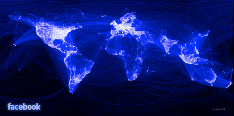
Paul Butler usually works as a grunt on the data infrastructure engineering team at Facebook, which gives him access to Facebook's mighty data warehouses. Which means his side projects take on a grand scale.
This one began with profile data from a scant 10 million people -- or about 2% of Facebook's users. Butler first tabulated the number of friends between each city, and what latitude and longitude each friend was at. Then, he created a color code: The more connections between two places, the lighter the line is; the fewer, the darker. What emerged, of course, is a map of the world unlike any other. That is, it's not a map of roads or airline routes or internet connections -- but a map of human relationships. Our physical geography becomes simply an emergent quality:

[Click for ginormous version]
The project bears a lot of similarity to work done by Pete Warden, using Facebook data. But in Warden's case, the data was a lot richer (note that he didn't ask to use the data, but merely scraped it using web crawlers). Here, the data is about the least revealing that you could find on Facebook, but the results are nonetheless stunning. As Butler writes:
What really struck me, though, was knowing that the lines didn't represent coasts or rivers or political borders, but real human relationships. Each line might represent a friendship made while traveling, a family member abroad, or an old college friend pulled away by the various forces of life... When I shared the image with others within Facebook, it resonated with many people. It's not just a pretty picture, it's a reaffirmation of the impact we have in connecting people, even across oceans and borders.
But what really boggles the mind is why Facebook isn't doing more work like this with its data, or least letting a select few use it -- the company possesses what amounts to the greatest catalog of human life ever created. It's no wonder that social scientists dream of getting just a fraction of that data, to study everything from how social connections are related to job markets, to disease transmission across city borders. After all, Facebook users are the ones who've provided this data. Shouldn't we be getting more out of it than the Top Status Trends of the Year?