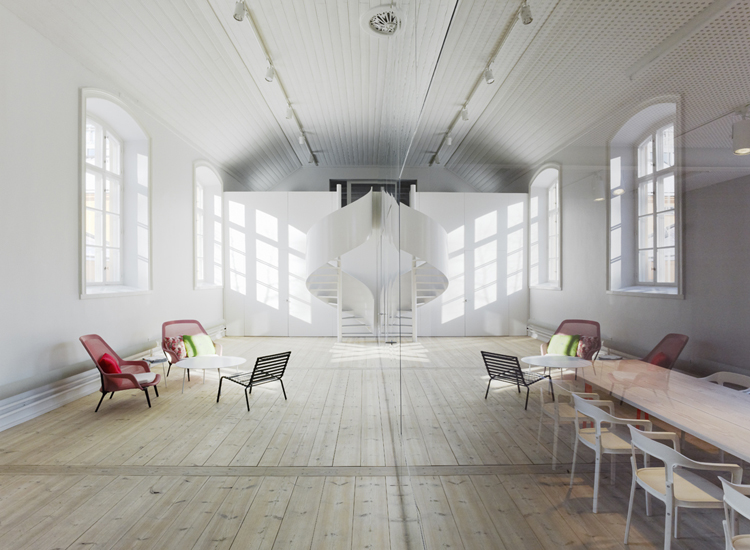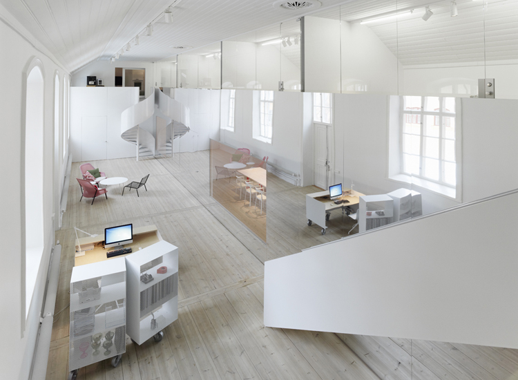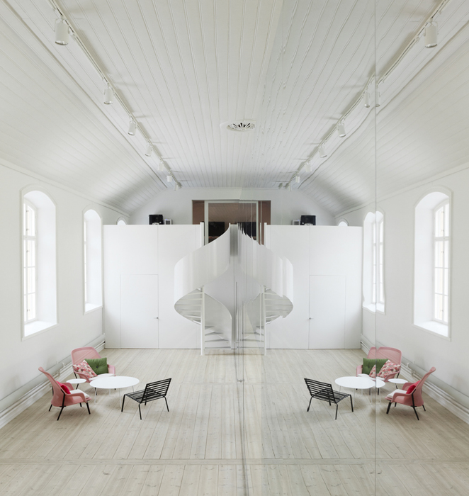
A carefully placed mirrored wall to reflects the imperfections and ravages of time.The small Swedish architecture firm recently transformed a pair of 19th-century buildings in central Stockholm into a bright, startlingly chic office for No Picnic, one of the largest design consultancies in the world. The 11,840-square-foot space looks as crisp as an office built five minutes ago, with blond floors and clean white walls and a dramatic spiral staircase, also white, that climbs whimsically to a small loft. The most impressive thing here, though, has little to do with what was added; it’s what they managed to conserve and spotlight. The new design reflects the history of the place, using a strategically positioned metallic wall to literally mirror the imperfections and ravages of time.

Both buildings -- one, an old exercise hall for troops, the other an erstwhile horse stable -- enjoyed what the architects called “the highest level of historical protection,” which is to say they couldn’t drill a single lousy hole without the preservationist’s blessing. And yet, during the architectural Dark Ages known as the 1980s, the buildings had been converted into showrooms, leaving the exercise hall with an awkward mezzanine that sliced the space lengthwise in two.
No Picnic wanted a large, open office. Unable to tear down the mezzanine, the architects smartly threw a metal wall over the divide, effectively doubling the apparent size of the room.
The wall also has a stunning trompe l’oeil effect. Large windows punctured in its surface appear like a looking glass, reflecting the huge arched windows and surrounding textures and details of the opposite wall, while the metal itself looks totally transparent. As the architects write, “the wall is there, yet it disappears.”


Which might sound like a lot of window dressing, a clever trick to cover up the architectural mistakes of the past. Ultimately, though, the wall ends up being more of a boon than a blight. It creates a row of private conference rooms that, thanks to the masterful optical effects, maintain a strong visual link to the rest of the space. Enclosed rooms are tough enough to finagle in an open-plan office, where privacy’s at a premium (as we’ve seen over and over again). But enclosed rooms that appear barely there -- that’s a feat for the ages.
[Images by Åke E:son Lindman; Hat tip to ArchDaily.com, which has more pics]"