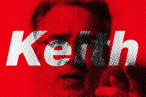
Launched in 2005 by former Vice President Al Gore (before An Inconvenient Truth fame) and entrepreneur Joel Hyatt, Current TV was originally a pretty drastic model of programming, featuring user-generated 'pods' reflecting a broad range of topics and opinions that lasted anywhere from 3 to 10 minutes. You could tune in at any time of day and just jump right in into whatever was going on and not have to worry about following typically scheduled programming. This was the same year YouTube launched and before it went as big as it is now, so the concept was fairly ahead of the curve. Current gathered some initial attention but then it just kind of disappeared as the novelty wore off and despite hiring former MTV Networks' President Mark Rosenthal, toying with the idea of going public, and transitioning into 30- and 60-minute programming Current felt anything but. Enter Keith Olbermann, the love-him-or-hate-him, ex-ESPN anchor turned political commentator. In February Current announced that Olbermann would be taking his show, Countdown With Keith Olbermann, from MSNBC to their cable channel starting June 20. Reminiscent of when Howard Stern announced he would be leaving the broader air waves for SiriusXM, Olbermann's move to Current gave it instant relevance. Last week, Current quietly introduced a new look, launched the website for Olbermann's show, Countdown, and over the Summer will be implementing the new look. The identity has been designed by Wolff Olins with motion assistance by Ghava, the on-air look is by loyalkaspar, and web design by Code and Theory.
Logo animation, brought to life by Ghava. Click here to view.
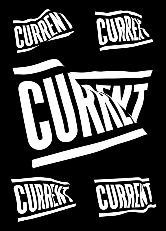
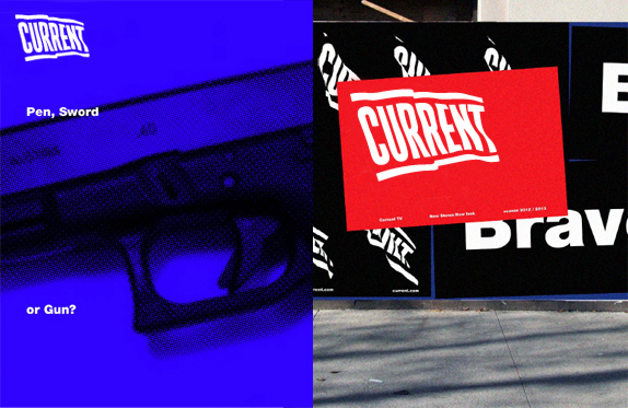
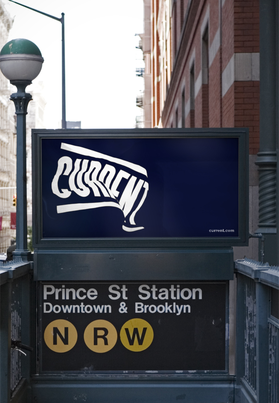
The previous identity was designed by Meta Design and Peter Saville and, at the time, the idea of a pixelated logo was somewhat forgivable despite the internet-sized cliché it represented. Six years later and the idea is inexcusable. Looking dated is an understatement. Current needed an extreme statement to indicate a completely new direction and almost erase its previous history to establish a new reputation. A flag, signaling they have arrived and that they stand for a specific kind of journalism, is exactly what they needed. And it looks awesome. Conceived as a moving logo first and static logo second, the execution is dynamic, bold, and innovative without feeling like it's trying hard to be cool and relevant. The black and white approach also gives it a sharp edge in contrast to all the colorful identities found on TV. The identity applications and on-air look are still limited but everything shows plenty of promise. So far, one of my favorite logos of the year.

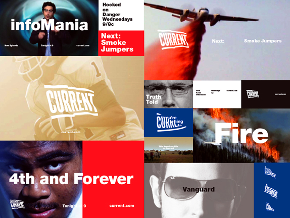
On-air look by loyalkaspar, above.
Vanguard promo, click here to view.