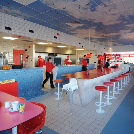
London designers Ab Rogers Design have designed the interior of a Little Chef restaurant in Popham, UK, for chef Heston Blumenthal.
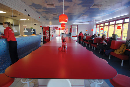
Inspired by “influences from the history of roadside eating,” the interior comprises red vinyl upholstery, and white ceramic tiles with cooking tips and illustrations printed on them.
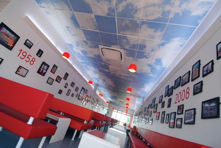
In collaboration with graphic design studio Praline, ARD also created the graphic design of the menu and uniform, signage and food packaging.
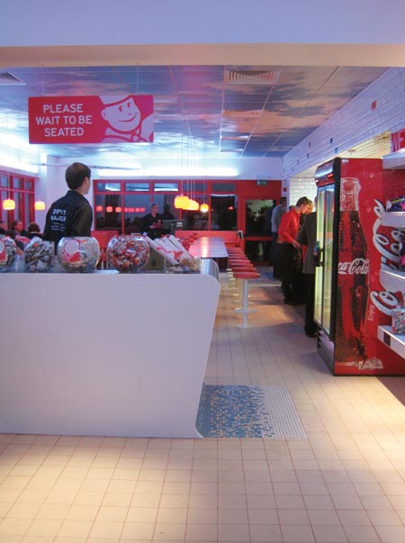
The designers installed “an interactive extract sound, all about food, which triggers when the customer enters the toilets,” created in collaboration with Dominic Robson of Robson & Jones, to encourage visitors using the toilets at the roadside restaurant to stay for a meal.
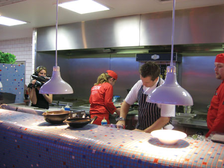
The restaurant was redesigned for a Channel 4 documentary called Big Chef takes on Little Chef, broadcast last week.

Here’s some more information from Ab Rogers Design:
–
Ab Rogers Design (ARD) was appointed by Michelin star chef Heston Blumenthal and commissioned by Little Chef to design a new future-facing Little Chef restaurant ready for the 21st Century.
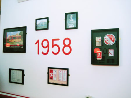
Heston Blumenthal and ARD’s new Little Chef in Popham is a multi-sensual oasis, an escape which reflects the best of modern 21st century Britain: fresh food, good service, and a positive outward attitude.
With a limited timeframe of three months from commission to completion, and a comparatively tight budget, ARD embraced the challenge of redesigning all the elements within the Little Chef brand, from the interior design of the restaurant to the graphics, from the menu and the uniform, to the signage and food packaging.
Working closely with Heston and the Little Chef team, ARD has developed the concept in collaboration with graphic design studio Praline for the branding and graphics, and Dominic Robson of Robson & Jones for the sound and interactive elements.
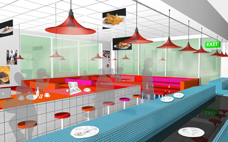
The result is an inspirational eatery, which engages and excites the old customers whilst welcoming and inspiring the new.
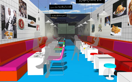
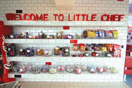
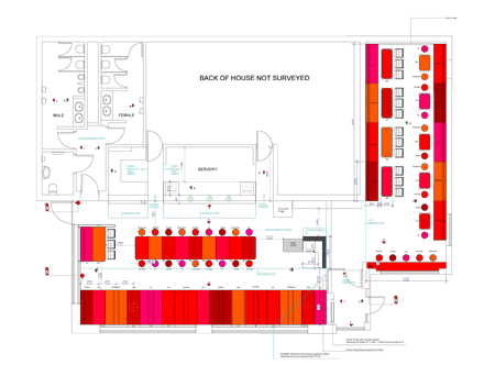
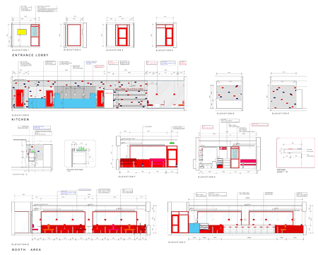
Drawing influences from the history of roadside eating – from coaching staging posts to turnpike taverns, early inns with their ‘snugs’ to chop houses, from eel and pie shops to American diners – a vocabulary of common materials and prefabricated details combined with timeless elements has been created. Key features are the use of laminate, vinyl upholstery, ceramic tiles, and pendant lighting.
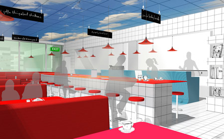
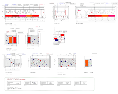
These simple materials have been put together in a sensitive manner. For example, the walls are covered in a grid of traditional butchers tiles, but at the same time they are contaminated by splashes of colour or some even have cooking tips and illustrations printed on them.
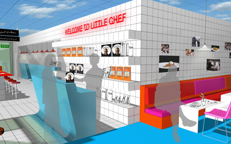
The tiled floor grid flows up to form an innovative micro-mosaic bar.
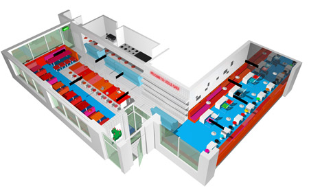
Standard perforated ceiling tiles make reference to a blue sky with a flock of seagulls flying across it. The sky feature connects all three of the restaurant’s dining areas: the Booth area, the Communal table area and the ‘Grab and stay’ lounge style low table area.
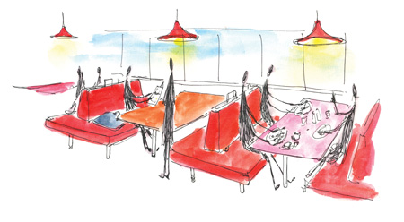
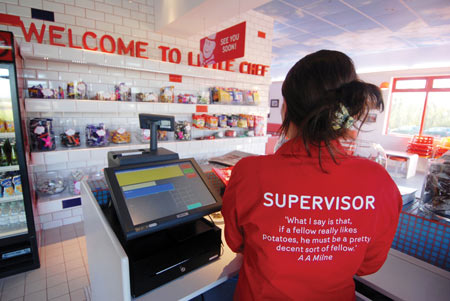
ARD and Praline have developed a palette for Little Chef’s new brand colour as part of the new brand identity by focusing on a new spectrum of red, and using Charlie, the much-loved brand character of Little Chef.
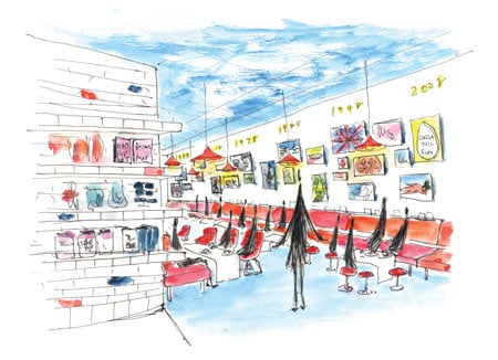
ARD has brought Charlie into the 21st Century, by minimising the design and making it coloured and mirrored.
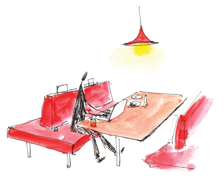
ARD has created a sophisticated yet humorous and intimate graphic identity that calibrates the history of Little Chef whilst uniting nostalgia with the modern colours and materials of the 21st century.
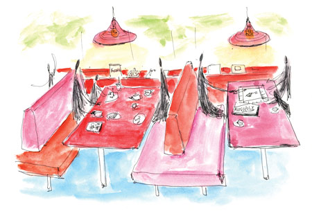
This is displayed in every element of the new brand, from the uniform to the restaurant, into the toilets, onto the signage and far beyond.
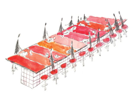
Another of the issues to be solved was to convert the many passers-by who stopped to use the toilet without spending a penny. ARD’s aim was to capture the imagination of these potential clients.
The new scheme incorporates a unique and unforgettable experience: Cooking tips screen-printed on the walls, the ambient sounds of the kitchen in the lobby, the aroma of coffee passing through the space, and an interactive extract sound, all about food, which triggers when the customer enters the toilets.
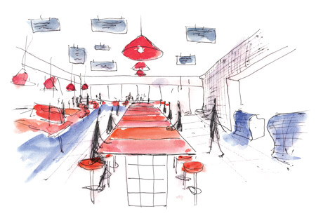
Together with Heston’s special new menu, ARD has turned Little Chef into a bright, clean space filled with wonderment and excitement.
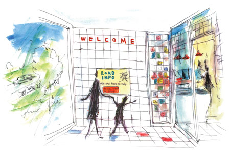
A place where one can happily escape and discover a new world, a new environment, new tastes and new smells. A scene of discovery with nostalgic corners with a sense of modernity that engages the past, and celebrates the future.

The Little Chef, Popham is a trial site and will operate as a blueprint for future roll outs following customer feedback.
Name project
Little Chef, Popham
Used materials
Laminate / Ceramic Tiles / Vinyl / Printed perforated ceiling panels / Mosaic tiles / Sounds and Colour
Construction methods
Assembled and Applied (Nothing’s been moulded). By ATLAS
Furniture manufacturer
Ethos Design Limited
Lighting manufacturer
Liminaires Limited (Consultant)
Floor manufacturer
Ceramic Tiles (Domus Tiles) + Glass Mosaic tiles (Domus Tiles) + Vinyl Floor (Altro)
Wall manufacturer
Ceramic Tile Wall (Domus Tiles)
Floor area (m2)
Approx 210 squared metres (Including Servery and Toilet)
Costs (€)
Approx £ 115,000 -> € 130,000 (Including New WC services and full architectural refurbishment)
Budget
Approx £ 100,000 -> € 113,000
Date of completion
21st November 2008